


The September patch (20.09) releases a new dashboard version, the Dashboard 2.0. This brings the JET technology into EPM solutions.
Background Info
The dashboard 2.0 is available for the following EPM solutions:
- Planning
- Financial Consolidation and Close
- Tax Reporting
Dashboard (1.0) and Dashboard 2.0 are using different backend technologies.
- Dashboard—Existing dashboards using Oracle ADF technology
- Dashboard 2.0—New dashboards using Oracle JET technology
ADF is using Oracle Application Development Framework, and JET is using Oracle JavaScript Extension Toolkit. The two dashboard versions coexist in the EPM solution. All the existing dashboards will still be using the dashboard 1.0 version. We can still create and update the dashboard using the existing dashboard technology. The new dashboard 2.0 has made great enhancements with the Oracle JET technology.
To create a version 2.0 dashboard, from the Dashboard listing page, click Create, and then select Dashboard 2.0.

Dashboard 2.0 has a new icon.

Dashboard 2.0 Features
When creating a dashboard 2.0, the interface is slightly different than creating a dashboard 1.0.

From the left side, we can toggle between Cubes, Library, and Visualizations.
Cube allows us to create an ad hoc analysis on the fly and create a dashboard base on that.

Library allows us to choose existing ad hoc and standard forms, chart types, and other objects

Visualizations allow us to add a different kind of charts. The supported chart types are Area, Bar, Bubble, Column, Combination, Doughnut, Funnel, Gauge, Geomap, Line, Pie, Pyramid, Radar, Scatter, Table with Spark Charts, Tile, Waterfall.

Also, utilizing the Oracle JET technology, the new design enables us to insert new components using search and drag and drop, delete components, and reposition components
It also supports the Dual Y-Axis and Logarithmic Scale which are very useful when we put $ and % in the same chart.

The background colors, border, global, and local POV bars can be customized as well.

Examples
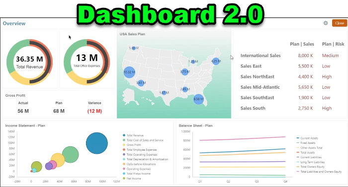
Using the Oracle public screenshot as an example. This is the type of chart that can be created via Dashboard 2.0.

The first thing you might notice is the Geomap chart type. It is a geographical map which overlays and the measure about each of the geographical areas.


The Pyramid chart type is a new type. It uses a triangle diagram to represent hierarchies visually. The triangle is divided into sections, illustrating vertically top-down and broad-narrow structures and processes.

The Waterfall chart type is another new type. It displays a running total of positive and negative values, which helps show how you arrived at a net value from an initial value. The columns can be color-coded to distinguish between positive and negative values.

The Radar chart type is a two-dimensional chart type designed to plot one or more series of values over multiple quantitative variables. Radar charts are best for determining which variable in the data is doing better than the rest. Hence, they are mostly used for performance analysis.

Considerations
1.The EPM cloud modules dashboards are still in dashboard v1.0. They have not been upgraded to v2.0.
2.We will need to manage dashboard v1.0 and v2.0 at the same time.
3.Quick Analysis feature allows us to add components to dashboards without having a prebuilt form. We can create an ad hoc query by typing member names in the search bar or using the Member Selector. Then we would control the layout of the query in the Layout tab Dashboard.
4.Geomap visualization is cool but it is limited. Oracle provides us with a metadata load file that contains geographical elements like countries, states, and cities. Note that geomaps only work if the geography names in the forms match exactly the geography names that Dashboard 2.0 uses for its map layers. If your entity/geography dimension says, for example, USA, that won’t be recognized as a valid name in the map layer, which uses the United States.

This Dashboard 2.0 surely provides us a great option for data visualization. I hope in the next release, the two versions can be merged and the geomap feature can be more flexible. Hope you enjoy this post and see you next time.